One common occurrence in data visualization1 is the need to control the ordering of a categorical variable. R provides a lot of ways to analyze and visualize non-numeric variables, but the default is to order these variables alphabetically, and that is rarely the precise ordering one might want.
1 The issue with ordering shows up in other contexts as well, basically any time you want to analyze ordinal data. For example, being able to change factor levels can be useful for a variety of model-fitting procedures as well.
Fortunately, one of R’s core data types is the factor. This data type has been maligned somewhat in the past, to the point that R no longer reads in strings as factors by default. But when you have ordinal categorical data, factors can be indispensable.
This tutorial covers two methods of setting the ordering of factor levels, to handle two common occurrences: “manually” setting a relatively small number of levels to s specific order, and setting potentially a large number of levels based on the ordering of a different variable. These are both handy when visualizing data, and are very straightforward once you understand how they work.
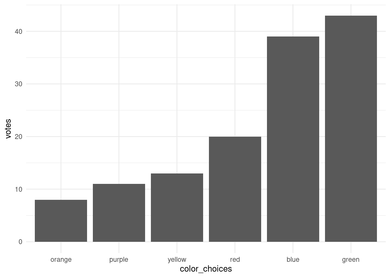
For example, let’s imagine we did a survey of people’s favorite color and came up with the following:
   color votes
1    red    20
2 orange     8
3 yellow    13
4  green    43
5   blue    39
6 purple    11
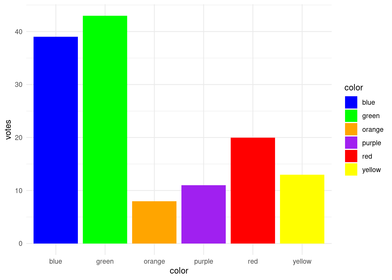
We can plot these as bars and use the colors themselves to assign the color of bars in a pretty straightforward way. The only trick is that when we are setting the colors of the bars, we need to make sure to (alphabetically) sort those color names, because that’s how R is ordering them by default. This is why “blue” is the first bar displayed and “yellow” is the last.
But sorting these bars in alphabetical order makes maybe the least sense! So let’s try two different techniques to get two different orderings.
What are factors, anyway?
But first, let’s talk about what factors actually are in R. One reason they can be tricky to deal with sometimes is that when they are examined, they look like strings. But a better way to think about them is as a vector of (contiguous) integers that have distinct labels for each integer value. If you can hold that kind of mental model of factors in your head, you’re less likely to be confused by how they work in practice.
In our data above, the color column is a vector of strings, or in R’s terms, “character”-type data. So let’s compare this to a new column that is simply a conversion of the character column to a factor.
When we summarize a factor, we get a summary of how many occurrences we have of each level. A factor level is simply the term for a possible value of that factor. But levels are inherently ordered, and if we get the levels() of a factor, they are returned to us in order. As you can see, the default order is alphabetical.
What is interesting is that when used in a numeric context, factors act like integers, where the first level has a value of 1, the second has a value of 2, and so on, up to the number of levels. We can see this here if we coerce our new factor to a numeric type:2
2 Note also that printing a factor also prints the levels, in level order. This is also true if we use unique().
print(favorite_colors$color_factor)
[1] red    orange yellow green  blue   purple
Levels: blue green orange purple red yellow
print(as.numeric(favorite_colors$color_factor))
[1] 5 3 6 2 1 4
For example, “red” is treated as a value of 5 because it is the 5th level in the factor.
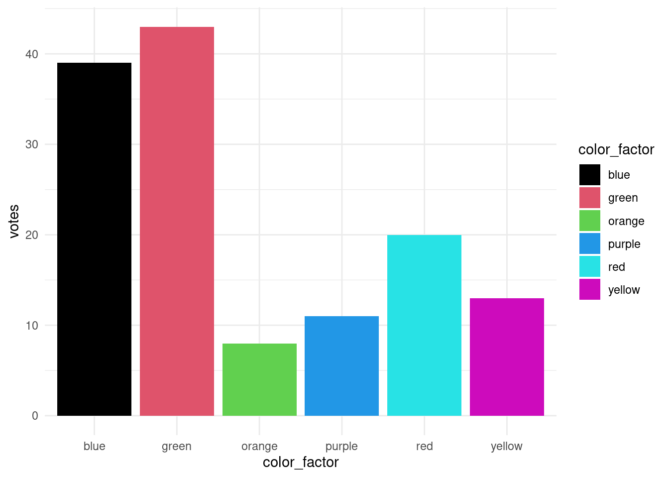
Sometimes this is helpful, but sometimes it can be surprising, if we forget that factors are essentially “integers with labels”. For example, if we try to plot our bars again, but this time using the color factor to set the colors, we get very different results.
What’s going on here? Where are these bizarre colors coming from? Now maybe you can see how working with factors can sometimes surprise you. Well, it turns out that instead of using the labels (“red”, “green”, “blue”, etc.) to set the fill values, because color_factor is a factor, it’s being treated as integers in this context. We can illustrate this easily by shouwing that you get the exact same results if you just use the values 1 to 6 instead:
The point here is to illustrate the mental model I am pushing about factors: you should think of them as consecutive integers (levels) with distinct labels for each level.
Setting the order of levels
Method 1: setting an order manually
So now that we see the issue, let’s talk about solutions. The essential issue here is how to set the order of the color factor. One simple way to set factor order is using the factor() function itself. One of the arguments of factor() is levels, and this simply takes a vector of strings, where the order of the strings in the vector sets the order of the levels that match those strings.
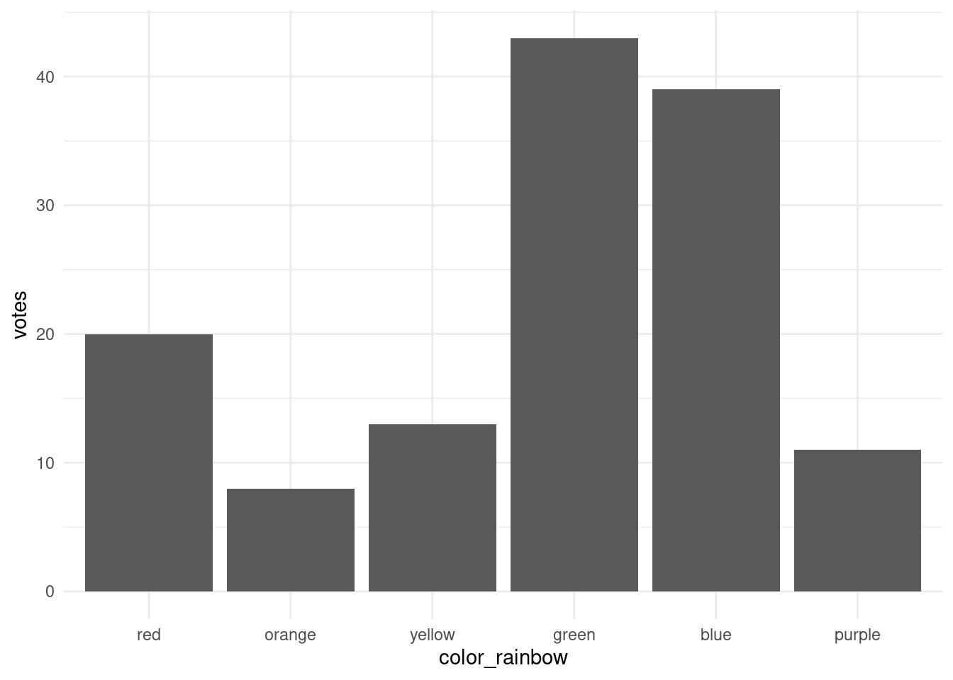
In our current example, we might want to set the order of the color levels to “rainbow” order. Here’s how we could do that, printing out the levels to demonstrate that the ordering worked.
As you can see, the bars are now ordered along the x-axis according to the factor level order that we specified, instead of alphabetical order.
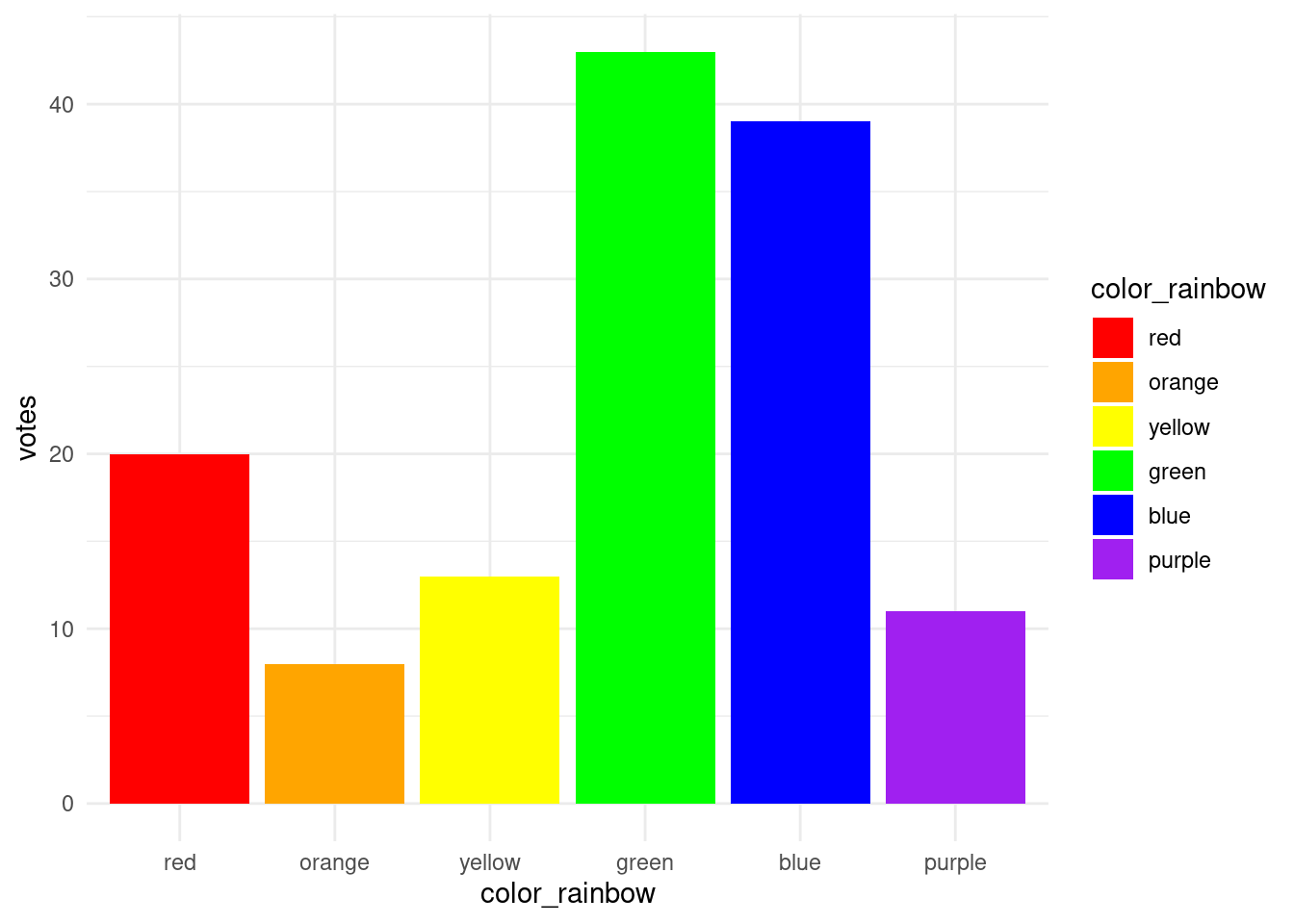
And now if we’d like to make the fill colors match the labels, we can use levels() to extract those labels, instead of letting R coerce the factor values to integers.
So now the fill values are ordered in our “rainbow” level order, as well as the ordering on the x-axis.
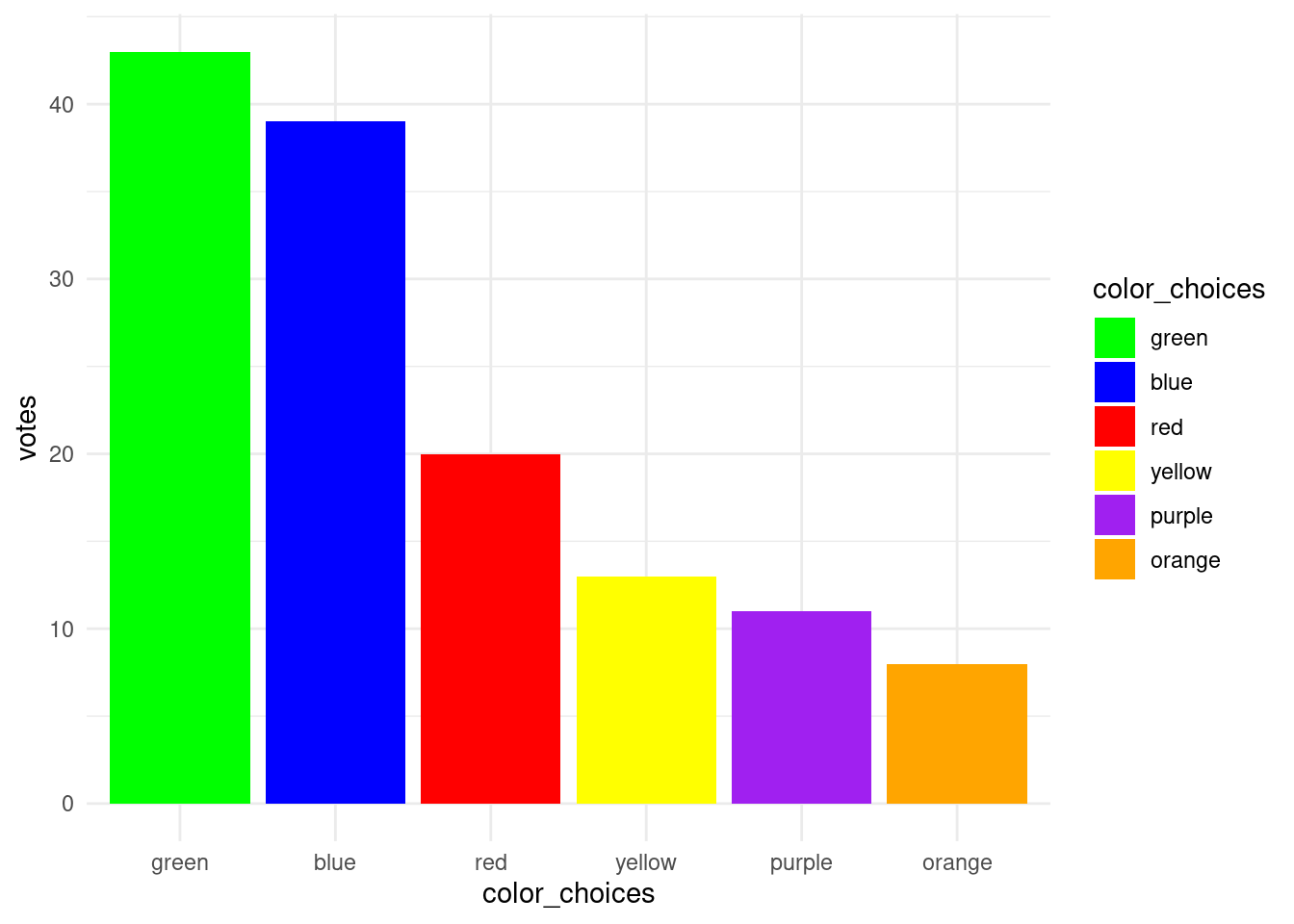
Method 2: ordering based on another variable
Being able to “manually” set the order of factor levels is very powerful, but sometimes you want the order to depend on something else. This is especially the case when you have a lot of levels, like if you have data for every US state, and you want to order the states according to some statistic you are examining.
To continue with our hypothetical color survey, we might want our bar chart to be “sorted” in the order of preference, rather than by some other arbitrary order like “rainbow” order. In order to do this, we use the reorder() function, which simply takes a factor (or something able to be coerced into a factor) as the first argument, and then another variable (of the same length) as the second argument, which determines the ranking of the factor levels.
Here’s what this looks like, and how the resulting plot looks:
So now the smallest value of “votes” aligns with the smallest factor level, and so on. If we would instead like to make the largest value of votes the first level, then we can set the argument decreasing = TRUE.
Now if we want to get the colors of the bars back into the plot, we can still use the same trick of setting the order of the values to the level order.
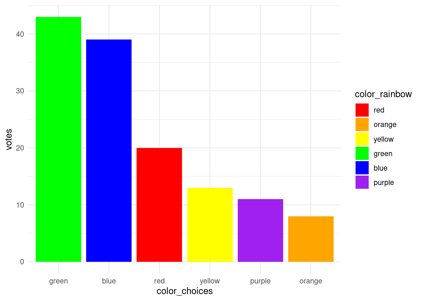
However, one small nitpick” the order of the fill colors in the legend is the same as the order on the x-axis, but maybe we’d like it to be in “rainbow” order. Here’s one last example, showing that you can “mix and match” a bit, where we can use the factor that’s ordered by the number of votes to set the x-axis order, but then use the factor ordered by our manual “rainbow order” to set the order of the fill values.
The point here is not the colors themselves, it’s the fact that by manipulating the order of factor levels, we can control the order in which things are displayed in our graph. If we want to set the order in an arbitrary “manual” way, we can use the levels argument of the factor() function to specify the order. But if we want the order of levels to be determined by something in our data, so that we can order the bars to be in decreasing order, we can use the reorder() function. And setting the decreasing argument of reorder() to TRUE or FALSE lets us control which direction we would like the ordering to go.
These factor-manipulating functions are simple base R functions, and they can be easily overlooked or underappreciated. But with a little practice, they are easy to use, and they can give us invaluable control over the way ordinal data is visualized.